Difference between revisions of "Scenery:Satellite and aerial image processing"
(→Histogram stretching) |
|
(No difference)
| |
Latest revision as of 20:57, 19 December 2008
Working with Landsat ETM+ imagery
Collecting the data
Obtaining free, high quality, aerial imagery is next to impossible outside of the USA. The USA has a general policy that if tax payers money was used to collect data then the public should have access to such data since they have already paid for it. Unfortunately this is not so for the majority of other nations in the world where we get taxed by government departments to produce the data and then have to purchase the data. I will not comment further on this practice since it makes me rather angry.
The other option is to use commercial aerial imagery but it is way too expensive in most cases and often has restrictive licensing making it unsuitable for use in flight simulator scenery. In this case we have no other options other than to find a suitable replacement even if it means lower quality. This is where Landsat 7 ETM+ satellite imagery comes onto the scene.
The nice folks in the US decided to launch satellites to map the surface of the earth and provide some of the acquired data for free. The two companies involved are the U.S. Geological Survey (USGS) and the National Aeronautics and Space Administration (NASA).
Some of the processed data that has been acquired from the Landsat series of satellites has been placed online for free download. The data that we are really interested in is Landsat 7 ETM+ data. The reason for this is that the data is of higher resolution than the data from the older Landsat satellites and it also captures the complete multispectral range from which we can create true color images.
The primary source I use for Landsat ETM+ data is the Earth Science Data Interface (ESDI) at the Global Land Cover Facility. http://glcfapp.umiacs.umd.edu:8080/esdi/index.jsp The interface is very simple to use so I won't discuss it any furthur.
The bands to download are 1,2,3 and 8. The file names will contain lots of numbers and letters which convey the date as well as the type of data. Don't worry about that just look at the end of the filenames for 10, 20, 30 and 80 and grab those. If you use a download manager make sure it doesn't try to download more than 2 files simultaneously otherwise you may get your IP banned for hammering their FTP server.
Creating RGB (true colour) composites
The first step in processing our drape imagery is to create a RGB composite (true colour image) using the Landsat ETM imagery. An RGB image consists of three unique bands – red, green and blue.
A lot of other satellites don't capture data in all three multi spectral bands which leads to a whole lot of problems. Fortunately for us the Landsat 7 satellite does capture all three bands that we require and which we have downloaded as described in the previous section.
The correlation between the Landsat and RGB bands are as follows :
- Band 1 = Blue
- Band 2 = Green
- Band 3 = Red
To create a composite we need to merge all three single bands into a three band image in the correct order. This can be accomplished in OpenEV by doing the following :
- Load all three bands in OpenEV
- Select “Image->Compose”
- Add the bands to the right pane in the order of 3,2,1
- Click on “save VRT” and give it a file name
- Close the VRT dialogue and open the VRT like you would a normal raster image
You should now have an image that looks rather dark but is no longer a plain grey scale image. If that is not the case double check that you created the VRT in with the bands in the right order.
A VRT is a virtual raster file – it is simply a text file describing how a collection of images must be combined into one. However OpenEV knows how to work with VRT's and it saves time and disk space working with them.
Do not modify the composite after creating it! It needs to remain in it's “raw” state for the fusion to work correctly.
Pan-sharpening the RGB composite
Pan-sharpening (also known as fusion) fuses the panchromatic band of higher resolution with a lower resolution colour image to create a higher resolution colour image. Landsat 7's sensors capture data in the multi spectral range at a resolution of approximately 28.5 meters per pixel and in the panchromatic range (black and white) of approximately 14.25 meters per pixel. By mixing the panchromatic data with the multi spectral data (RGB image) we can end up with a slightly blurry colour image with a resolution of 14.25 meters per pixel. It's not quite as sharp as the panchromatic band on it's own but it's much better than the original RGB image!
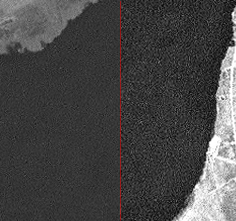
The first thing I do before a fusion operation is to check the panchromatic band for noise. All the Landsat data I have used contains a grid of noise in the pan band which causes major problems in the fusion process. The noise is most noticeable in areas that have a flat colour such as bodies of water or large fields.
Below is an example of a noisy pan band.
On the left is the unmodified pan band while the right hand side shows the same image with just some contrast and lightness adjustments that make the noise really stand out.
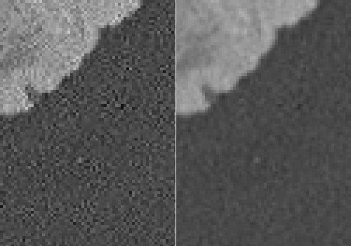
What I do in this case is apply a 1x1 Gaussian blur on the pan band to mix the noise in properly. Ideally one should have some fancy image processing software that can identify patterns and remove the noise. However I don't know of any software that does this. Blurring the pan band sounds counter intuitive but it actually works very well as illustrated below. Just don't over do the blurring otherwise there is no point in trying to do any fusion! I use nip2 to do the blurring but you can use GIMP or Photoshop too although they generally don't handle images larger than RAM very well since they are mainly designed for speed and try to load the entire image into RAM at full resolution.
Before blurring your image you need to save the meta data contained inside the TIF file and then afterwards restore the meta data since most graphics apps are not “geo aware” In other words they throw the geographical meta tags away when you save the file. Not having geo-referenced data will be a problem later on.
To save and restore the GeoTIFF meta tags use listgeo and geotifcp (both part of the Open Source libgeotiff).
Example :
listgeo original-pan-band.tif > pan_meta.txt
geotifcp -g pan_meta.txt modified-pan-band.tif output-pan-band-blurred.tif
Below is an example of the original pan band versus a blurred pan band.
Notice how the noise is far less noticeable at the expense of a bit of sharpness.
Now lets do the actual pan-sharpening!
- Start OpenEV and load both the panchromatic and RGB image (VRT).
- Select Image->Fusion and select the panchromatic and RGB images.
- Set the Fusion Method to “Kernel Grain Merge” and 50% sharpness.
- Click merge (and go make a cup of coffee or tea if it's full Landsat scene).
You should get an image that looks like the original RGB image except that it's a lot sharper.
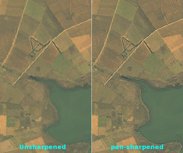
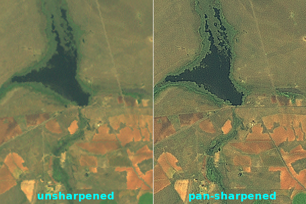
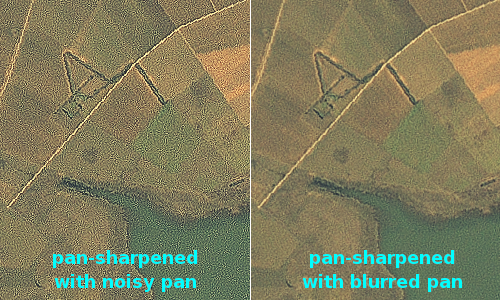
Below are some comparisons after some histogram stretching (to make things look nicer).
Notice how the edges of the dam and the roads are much more crisp. You can also see that the pan-sharpened image contains a bit more noise but this is not a problem because it will be smoothed out by OpenGL in the simulator.
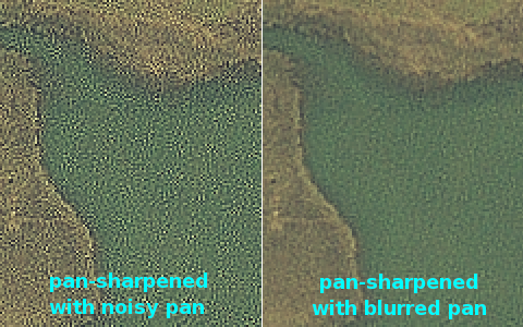
Below are two images that show what happens when you don't blur a noisy panchromatic band before a fusion process.
As can be seen above using an unblurred, noisy panchromatic band creates a barely perceivable improvement in sharpness at the expense of a lot of noise when used in a fusion process.
Histogram stretching
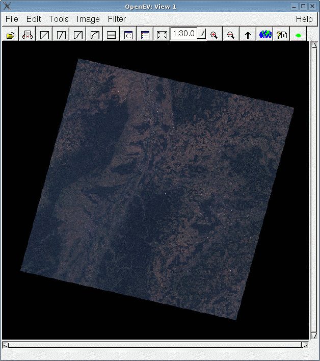
At this stage you should have a rather dull looking image that is pan sharpened. Below is an example of a pan-sharpened image in South Eastern France.
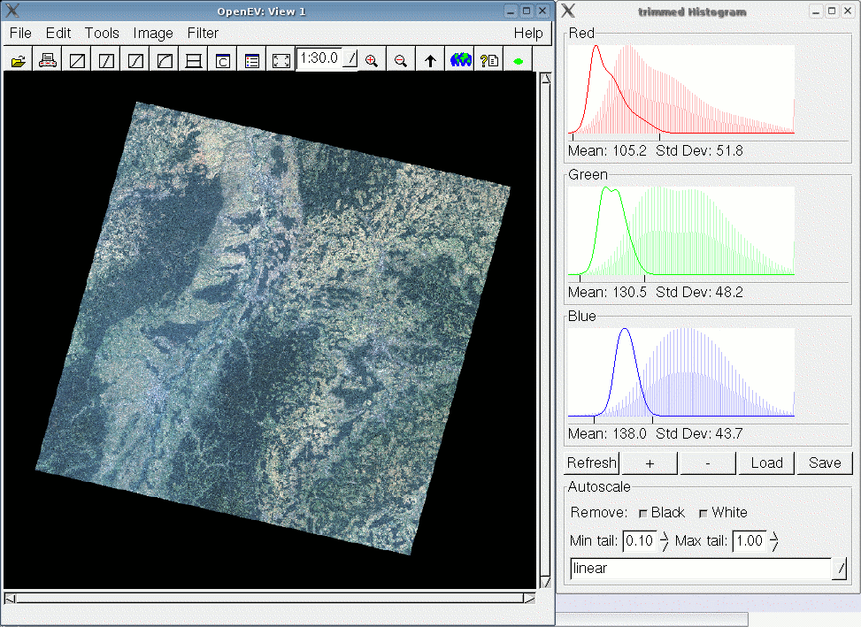
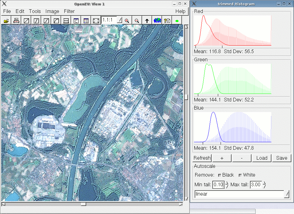
What we want to do increase the brightness and contrast of the image. To do this load the image in OpenEV and run the Histogram Enhance tool. It may take a while to bring up a window so be patient - it's busy analysing the entire image in the background. Once the histogram tool has loaded select "linear" from the combo box and you should see an noticable improvement in the color and brightness like in the image below.
Try playing around with the settings to get a feel of how the histogram stretching works. You can set stretch amount for each channel by clicking on the channels with the left and right mouse buttons. Just be careful to not over do the stretching or to make one band too different from the others otherwise you'll end with some very unatural looking images.
Now for the bad news. Unfortunately some objects in aerial or satellite imagery reflect more light than other objects. Snowy mountains, cement buildings, runways, mine dumps, sand quarries, etc. will reflect a lot of light while forests, water, etc. will absort a lot of light. When doing a linear histogram stretch one can end up with the bright areas being over saturated. Over saturation will make bright objects almost pure white and you will lose a lot of detail. Up till now I haven't found a tool that can do more intelligent stretching. Ideally one needs to stretch the bright areas less than the dark areas but root and logarithmic stretches don't work very well.
Below is an example of over saturation. Notice how the buildings in a city become almost pure white.
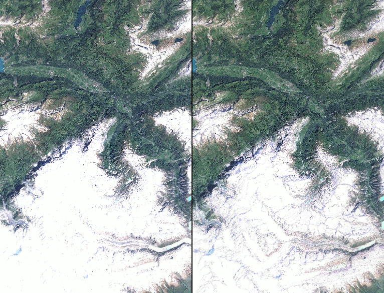
The snowy European Alp mountains are a problem in particular so I had to make a work around solution. I hacked vips so that I can mask out all the pixels with a value above a certain threshhold. I end up with an image that has holes (black pixels) cut in it. Then I stretch the masked out images and recombined them with the originals in imagelinker. This way I retain the snowy detail but can now get nice green valleys. It's not perfect but take a look at the results below and you'll see that it is certainly worth the effort even though the solution is a real kludge. The hacked code for masking in vips2 can be found in chapter 1.
Unmasked on the left vs masked on the right. Notice how most of the details on the mountain tops are lost without masking.
Step 1 : Check the original for highlights. Skip the process if not required. Step 2 : Mask the highlights out in nip2. Step 3 : Stretch the masked image. Step 4 : Combine the original with the stretched and masked one in imagelinker.
Working with aerial imagery
Collecting data
DOQs/DOQQs (Digital Orthophoto Quadrangles) are a fairly common source of ortho rectified imagery and are far easier and cheaper to obtain than commercial satellite imagery. The difference between DOQs and satellite imagery is that DOQs are created from aerial surveys. Special cameras are mounted in aircraft and a grid of photos are taken. The photos are then developed, scanned into a digital format, geo referenced using GPCs (Ground Control Points) and ortho corrected.
One of the advantages of DOQs is that there is normally no cloud cover since the surveying is planned according to weather. Satellites take huge snapshots of the earth and are above any clouds while aircaft can fly underneath high cloud cover and avoid taking pretty pictures of white fluffy things. :) Another advantage is that the resolution is generally very high. 0.5 to 1 meters/pixel is quite common and this will make some sharp looking scenery for Silent Wings even when downsampled to 2 or 4 meters/pixel.
Most government surveyors will have a good stock of DOQs on hand since they are used a lot for planning housing development and infrastructor as well as for environmental surveys. The best online sources of DOQs and aerial imagery that I have come across for the USA are from TerraServer-USA as well as Sources of free orthoimagery - World Wind Wiki For other countries you'll have to source them from a private company or maybe a government surveyor.
Colourizing DOQs
Not all DOQs are in color. In fact the vast majority of them are in black and white. This is slowly changing as more and more aerial surveying companies switch to color digital cameras. If you can only find black and white DOQs and want to create a very small area of scenery then they can be of use if you colorize them by hand. It's a painfully slow process and won't look quite as good as a normal true color photo but it may be worth the effort. I won't go into the actual procedure since it is best described here : Colorizing grayscale Digital Orthophoto Quadrangles (DOQs) in Photoshop
Creating mosaics
Once you have a collection of images you need a way to join them together into a single seamless image. Although the Silent Wings scenery tools can do mosaicing we want to make a feather blended mosaic and not a plain mosaic. A plain mosaic will have join lines where the images overlap. With feather blending the images will blend together and you will not see any ugly edges in the scenery. I am not going to describe how to do feather blending in imagelinker - you can read the imagelinker documentation which contains a nice section on mosaicing. The documentation is available on the OSSIM web site. There are however a couple of tricks that I need to mention that are specific to our imagery.
Trimming edges 1
Because of the pan-sharpening our images will have edges that are no longer a sharp transition to null (black). These edges will create lines in the scenery and must be trimmed before mosaicing. I use a wide black brush in nip2 to do the trimming. The nip2 code for extra large brushes can be found in chapter 1. Below is an example of an untrimmed vs trimmed image.
Trimming edges 2
Depending on what area of the world the imagery comes from you may have large or small overlaps between the landsat tiles. I trim each tile by hand to make the overlaps as small as possible while leaving enough overlap so that the tile transistions will be big enough to not make noticable seams. This is neccessary for two reasons. 1. Not all images are georeferenced or ortho corrected accurately enough and you often end up fuzzy or blurred images in the overlap zones. 2. If there are significant differences between the images you will get semi transparent objects showing up. One example is clouds which are only in one scene. You end up with opaque looking clouds which can often be totally elliminated by trimming the overlaps.
extract_vertices
Because our images are not a plain rectangle and contain fillers (black portions) we need to tell imagelinker where the corners of the image are actually located in the image. This is neccessary for the feather blending to work correctly. The tool to use for this is called extract_vertices and running it on an image will produce a kwl file which imagelinker will automatically use.
Once you have a feather blended mosiac you may have to chop the image up into pieces for the Silent Wings scenery tool texmapper. texmapper needs GeoTIFFs and TIFF files are limited to 4GB in size. Unless the area you are working on is really big you can probably just export the image as is. To export the image use the "igen" exporter in imagelinker. This is also in the imagelinker documentation so I won't describe how to use it as it's pretty straight forward.
Below is an example of a plain mosaic (left side) verses a feather blended mosaic in imagelinker (right side).
